A canvas is a window that manages its child windows. Different canvases provide a range of support, including the following:
With the canvas classes, you can build windows with multiple child controls that contain fixed-size areas, user-sizeable areas, and scrollable areas. In addition, a canvas control lets you control tabbing between child controls, providing an alternative to using dialog boxes.
Generally, you build a complex window with a canvas control as the client area. This canvas can contain other canvas controls to build the desired layout.
The canvas classes are:
The set and multicell canvases automatically size and position their child windows for you, based on the child window's minimum size.
A split canvas places its child controls into panes. The panes are separated by movable or fixed split bars. (The default is movable split bars.) A split canvas can have its split bars oriented vertically or horizontally.
| Note: | In Motif, you can only move the split canvas using the small square buttons. However, in Windows and OS/2, you can move a split canvas using any part of the split bar line. |
Use a split canvas to contain controls that can be resized to display more information, such as list boxes, containers, MLEs, and notebooks.
| Note: | Use the IListBox::noAdjustPosition style on a list box control in a split canvas because, otherwise, the operating system may adjust the height of the list box so it will not fill the height of the split canvas. |
The order in which you create the child controls determines both their relative position on the split canvas and the order in which tab and cursor keys switch focus between them. For a canvas with vertical split bars, the child controls are arranged with the control that was created first in the leftmost pane. For a canvas with horizontal split bars, the control that was created first is placed in the top pane.
A set canvas arranges its child controls in either rows or columns. The Open Class Class Library uses the term deck for either a row or column. You can arrange the decks of a set canvas either horizontally or vertically. The set canvas attempts to place the same number of controls in each deck.
Each deck is created large enough to contain the largest control in the deck. To do this, the canvas calls the minimumSize member function for each child control. For controls that have sizes defined by the text they contain, such as push buttons and radio buttons, this default processing is normally sufficient. However, for a control that does not have a well-defined size, such as a list box or multiline edit control, you need to set its minimum size by overriding the calcMinimizeSize member function or by calling its setMinimumSize member function before adding it to the set canvas.
| Note: | Your application can determine the best minimum size for list boxes, multiline edit controls, containers, and frame windows. |
The order in which you create the child controls determines their positions on the set canvas and the order in which tab and cursor keys switch focus between the controls. Several styles are available to control the orientation of the decks and the placement of controls within the decks. You can also alter the spacing between controls and between the decks and the edge of the canvas.
A multicell canvas consists of a grid of rows and columns and looks like a spreadsheet. You place child controls on the canvas by specifying the starting cell and the number of contiguous rows and columns that they can span. You can refer to cells in the grid by the column and row value. The top left cell coordinate is (1,1).
The default cell size is 10 pixels high by 10 pixels wide. The actual number of rows and columns in the canvas is the highest row and column value used. For example, a radio button is placed at (4,5) and a push button at (2,7). Therefore, the canvas has 4 columns and 7 rows. Columns and rows can also be referenced by setColumnWidth and setRowHeight.
The initial size of a row or column is determined by the size of the largest control in that row or column. By default, the row and column sizes are fixed. You can make the rows and columns expandable by using setColumnWidth and setRowHeight (setting the parameter expandable=true), in which case sizing the canvas also sizes them.
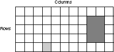
The following figure shows a multicell canvas. Notice that the small window's location is at column 4, row 5 (4,5), while the large window starts at column 9, row 2 (9,2). The large window is 2 columns wide and 3 rows long.
| Note: | A child window in a fixed-sized row and column is automatically sized based on its minimum size, which is typically based on the window's content and the available area within the window. |
You can also leave rows and columns empty to provide spacing between child controls. If you do not explicitly size the empty rows and columns using setRowHeight and setRowWidth, they are sized to the default cell size.
You cannot have more than one window occupy the same "starting cell". (Starting cell means the start row and column you specify when you call addToCell.) However, you can have overlapping cells.
The size of a row or column is initially established by calculating the minimum size needed to hold all the windows in the row or column. In practice, this means the width of a column is set to the minimum width of the largest window in the column. The width is determined by calling IWindow::minimumSize on all windows in the column. The application can set the width or height of a column or row, respectively. If an attempt is made to set a value less than the minimum size of the largest window, the value is saved but ignored because the minimum size is the larger of the hard-coded size for the cell and the minimum size of the window. In other words, the application can reserve more space than the window needs but cannot cause the clipping of the window to occur.
A column or row never has a smaller width or height than the minimum size of the largest window in the column or row. If the windows later calculate a smaller minimum size, the width or height of the column or row is the larger of the following:
The minimum size of the canvas is based on the minimum sizes of all the windows on the canvas plus the size of empty rows and columns. If the area allotted to the canvas is less than this size, the canvas is clipped at the lower right corner. You can use the IViewPort class to add scroll bars to handle this situation.
The multicell canvas has two styles that can help you create layouts with a multicell canvas by providing a way to easily visualize the placement and size of each child window. The gridLines style causes the multicell canvas to have grid lines between the rows and columns of the canvas. Grid lines are stationary. If you want grid lines that you can move with the mouse, use the dragLines style, which causes the multicell canvas to have draggable grid lines between the rows and columns of the canvas.
Here are some considerations when using grid lines and drag lines:
Refer to the Open Class Library Reference for more information about ISplitCanvas.
A view port canvas provides a scrollable view area with horizontal and vertical scroll bars. By default, the scroll bars display only when needed. A view port can have only one child control. The size of the child control is fixed. If the view port is smaller than the child control, the view port allows the user to scroll the child control.
If you need more than one control in a view port, place the controls into another type of canvas, which you can then make the child of the view port.
Notebooks
Layout Using
Canvas Controls
Using List and
Slider Controls
Creating and
Using Text Controlsf
Creating and
Using Notebooks
ICanvas
IDrawingCanvas
IMulticellCanvas
ISetCanvas
ISplitCanvas
IViewPort
