You can set the text and its color, size, and position in the static text window.
Refer to the reference documentation for a list of the public members provided with IStaticText as well as information on the other static control classes.
The following sample comes from the ahellow1.cpp file from the Hello World sample application and shows how to create a static text control:
IStaticText hello(WND_HELLO, &mainWindow, &mainWindow);
hello.setText(STR_HELLO);
hello.setAlignment(IStaticText::centerCenter);
mainWindow.setClient(&hello);
The first line uses the window ID, the parent window, and the owner window to create the static text control and an object for it.
The second line sets a text string in the control using the setText member function, which is inherited from ITextControl. The string is provided in the resource (.rc) file.
The third line uses the setAlignment member function to center the static text.
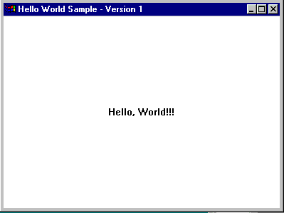
The following figure shows the Hello World version 1 static text control:
If the application requires more sophisticated text-editing capabilities and multiple lines of text from the user, the application can use a Multiline edit field.
Applications typically use entry fields in dialog windows, although they can be used in non-dialog windows as well. The following section contains a sample and an example to show you how to create an entry field.
- Declare three entry fields in the .hpp file, as follows:
#include <ientryfd.hpp> /***********************************************************/ /* Create the frame window */ /* Declare the entry fields */ /***********************************************************/ class AppWindow : public IFrameWindow { public: AppWindow(unsigned long windowId); ~AppWindow(); void handleEvents(unsigned long eventtype); private: ICanvas canvas; IEntryField ef1; IEntryField ef2; IEntryField ef3; ACommandHandler * commandHandler; }; - Construct the entry fields in the .cpp file and
manipulate data inside them.
/*************************************************************/ /* Window constructor */ /*************************************************************/ #include "entryfd.h" #include "entryfd.hpp" #include <icoordsy.hpp> //******************************************************* // Define a customized style to use in the third entryfd //******************************************************* IEntryField::Style efStyle = IWindow::visible | IWindow::tabStop | IWindow::group | IEntryField::margin | IEntryField::autoScroll; AppWindow :: AppWindow(unsigned long windowId) : IFrameWindow("Entry Field Example", windowId, IFrameWindow::defaultStyle() | IFrameWindow::menuBar), canvas(ID_CANVAS, this, this), ef1(ID_ENTRY, &canvas,&canvas, IRectangle( 10, 200, 600, 240)), ef2(ID_ENTRY2, &canvas, &canvas, IRectangle( 10, 125, 300, 175)), ef3(ID_ENTRY3, &canvas, &canvas, IRectangle( 10, 50, 300, 100), efStyle) { //******************************************************* // Create first entry field //******************************************************* ef1.setLimit(50); ef1.setText("Initial Text for Entry Field 1"); ef1.setBackgroundColor(IColor::kYellow); ef1.setForegroundColor(IColor::kRed); ef1.setBorderColor(IColor::kGreen); ef1.setFocus(); //******************************************************* // Create second entry field //******************************************************* ef2.setLimit(50); ef2.setText("Initial Text for Entry Field 2"); ef2.setBackgroundColor(IColor::kYellow); ef2.setForegroundColor(IColor::kRed); ef2.setBorderColor(IColor::kGreen); //******************************************************* // Create third entry field //******************************************************* ef3.setLimit(50); ef3.setText("Initial Text for Entry Field 3"); ef3.setBackgroundColor(IColor::kYellow); ef3.setForegroundColor(IColor::kRed); ef3.setBorderColor(IColor::kGreen); moveSizeTo(IRectangle(0, 0, 670, 350)); canvas.setBackgroundColor(IColor::KBlue); setClient(&canvas); show(); commandHandler = new ACommandHandler(this, &ef1, &ef2, &ef3); commandHandler->handleEventsFor(this); } - Declare a command handler in the .hpp as follows:
class ACommandHandler : public ICommandHandler {

public:
  ACommandHandler(AppWindow *efWindow,
                  IEntryField *ef1,
                  IEntryField *ef2,
                  IEntryField *ef3);

protected:
  virtual bool command(ICommandEvent& cmdEvent);

private:
  AppWindow *ef;
  IEntryField *ef1,
              *ef2,
              *ef3;
};
- Add event handling in the .cpp to manipulate the data
inside the entry fields as follows:
        ACommandHandler::ACommandHandler(AppWindow *efWindow,
                                 IEntryField *ef1,
                                 IEntryField *ef2,
                                 IEntryField *ef3):
    ef(efWindow),
    ef1(ef1),
    ef2(ef2),
    ef3(ef3)
{
}


bool ACommandHandler::command(ICommandEvent& cmdEvent)
{
  switch (cmdEvent.commandId())
   {
     case ID_READONLY_ITEM:
      ef1->enableDataUpdate(ef1->isWriteable());
      break;
     case ID_COPY_ITEM:
      if (ef1->hasSelectedText()) {
        ef1->copy();
      }
        break;
     case ID_CUT_ITEM:
      if (ef2->hasSelectedText()) {
        ef2->cut();
       }
        break;
     case ID_PASTE_ITEM:
      if (ef3->clipboardHasTextFormat()) {
        ef3->paste();
        }
        break;
     case ID_CLEAR_ITEM:
      if (ef3->hasSelectedText()) {
        ef3->clear();
        }
      break;
      return true;
   } // end of switch
    return false;
}
The following figure shows the entry fields created using the preceding example:

Viewing and Editing Multiline Edit (MLE) Fields
A multiline edit (MLE) field enables users to view and edit multiple lines of text. Use the IMultiLineEdit class to create an MLE field. The member functions of the IMultiLineEdit class enable you to display text files with horizontal and vertical scrolling, read a file into and save it from an MLE, or perform basic clipboard tasks (for example, cut, paste, copy, and clear).

Some library styles and functions are ignored on Windows, for example MLE::enableWordWrap. For more information, refer to the member function descriptions in the reference section of the documentation.
Creating an MLE
To create an object of the IMultiLineEdit class, include the ID of a specified MLE, the parent and owner windows, an IRectangle object, and one or more styles.
Styles define such functions as scrolling text, wrapping words, adding a border, and making the field read-only.
Refer to the reference documentation for further information about the IMultiLineEdit class and its styles. To create an MLE, use the following steps.
- Declare an application frame window that contains an MLE
and a command handler that can process events for the
MLE, as follows:
/********************************************************/ /* Create the command handler */ //*******************************************************/ class ACommandHandler : public ICommandHandler { public: ACommandHandler(AppWindow *mleWindow, IMultiLineEdit *amle); protected: virtual bool command(ICommandEvent& cmdEvent); private: IMultiLineEdit *mle; }; /***********************************************************/ /* Create the frame window */ /***********************************************************/ class AppWindow : public IFrameWindow, public ICommandHandler { public: AppWindow( unsigned long windowId); ~AppWindow(); private: about(); ITitle title; IMultiLineEdit mle; ACommandHandler * commandHandler; }; - Constructs the MLE in the .cpp file as follows:
/*************************************************************/ /* Window Constructor */ /*************************************************************/ AppWindow :: AppWindow( unsigned long windowId) : IFrameWindow(windowId, // create Frame window defaultStyle() | menuBar), title(this,"MLE Example"), // include Title mle(ID_MLE, this, this) // create MLE { setClient(&mle); handleEventsFor(this); setIcon(ID_ICON); mle.setFocus(); //********************************************************* // Create Command Handler //********************************************************* commandHandler = new ACommandHandler(this, &mle); commandHandler->handleEventsFor(this); - Use the following code for event handling:
/***********************************************************/
/*          Command Handler Constructor                    */
/***********************************************************/
ACommandHandler :: ACommandHandler (AppWindow *mleWindow,
                                    IMultiLineEdit *amle):
  mle(amle)
{
}

/***********************************************************/
/* MyWindow Command Event Handler                          */
/***********************************************************/
bool ACommandHandler :: command(ICommandEvent& cmdevt)
 {
   switch (cmdevt.commandId())
   {
      case ID_IMPORT_ITEM:
         mle->importFromFile("import.txt",IMultiLineEdit:: MLEFormat);

         return true;

      case ID_EXPORT_ITEM:
         mle->exportToFile("export.Txt",IMultiLineEdit:: noTran);
         return true;

      case ID_INIT_ITEM:
         mle->setText("This is some initial text.");
         return true;

      case ID_MARK_ITEM:
         mle->selectRange(IRange(13,19));
         return true;

      case ID_COPY_ITEM:
         if (mle->hasSelectedText())
           mle->copy();
         return true;

      case ID_CUT_ITEM:
         if (mle->hasSelectedText())
           mle->cut();
         return true;

      case ID_PASTE_ITEM:
         if (mle->clipboardHasTextFormat())
           mle->paste();
         return true;

      case ID_DELMARK_ITEM:
         if (mle->hasSelectedText())
           mle->discard();
         return true;

      case ID_DELALL_ITEM:
         mle->removeAll();
         return true;

      case ID_INSERT_ITEM:
         mle->add("inserted");
         return true;

      case ID_WORDWRAP_ITEM:
         mle->enableWordWrap(!mle->isWordWrap());
         return true;

      case ID_HOME_ITEM:
         mle->setCursorPosition(0);
         return true;

   } /* end switch */
   return false;
}
Loading and Saving a File
The following member functions from the IMultiLineEdit class allow you to import text to an MLE from a file and export text from an MLE into a file.
| Member Function | Use To | |
|---|---|---|
| importFromFile | Load a file into an MLE | |
| exportToFile | Save from an MLE | |
| exportSelectedTextToFile |
Save marked text in an MLE into a file |
You can load and save a file to the MLE, as follows:
    case ID_IMPORT_ITEM:
      mle->importFromFile("import.txt",IMultiLineEdit::MLEFormat);
      return true;

    case ID_EXPORT_ITEM:
      mle->exportToFile("export.txt",IMultiLineEdit::noTran);
      return true;
Positioning the Cursor
You can position the cursor on a specific line of an MLE or in
a
specific character position, add to or remove lines from an MLE,
or request the number of lines in an MLE.
Position the cursor on the first line, as follows:
      case ID_HOME_ITEM:
         mle->setCursorPosition(0);
         return true;
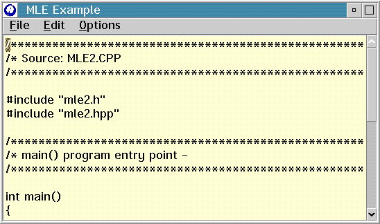
The following figure shows the cursor on the first line of the MLE:
Performing Clipboard Operations
The IMultiLineEdit class has several member functions to perform clipboard operations, including copy, cut, paste, clear, and discard. After you define an MLE, use these member functions to copy text to the clipboard, cut and put text into the clipboard, or paste only the marked lines from the clipboard.

In Motif applications, you select a range of text by pressing mouse button 1. To paste text, you use mouse button 2.
The following code performs clipboard operations:
case ID_MARK_ITEM: // First mark some text
mle->selectRange(IRange(13,19));
return true;
case ID_COPY_ITEM:
if (mle->hasSelectedText())
mle->copy();
return true;
case ID_PASTE_ITEM:
if (mle->clipboardHasTextFormat())
mle->paste();
return true;
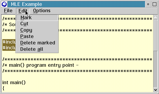
The following figure shows an example of cutting text to the clipboard. It contains marked lines in the client area and a menu option, Edit, with six menu items, including Cut. The menu item ID of the Cut menu item is ID_CUT_ITEM.
member function:
  case ID_CUT_ITEM:             // Check that text is marked
    if (mle->hasSelectedText())       // then cut it to the clipboard
       mle->cut();
    return true;
A user can select a button by clicking it with the mouse or by pressing the spacebar when the button has the keyboard focus. In most cases, a button changes its appearance when selected.
A button is always owned by another window, usually a dialog window or an application's client window. It posts messages or sends notification messages to its owner when a user selects the button. The owner window receives messages from a button and can send messages to the button to alter its position, appearance, and enabled or disabled state.
To use a button in a dialog window, your application specifies the control in a dialog template in the application's resource-definition file. The application processes button messages in the dialog-window procedure. This is not supported on Motif.
Understanding Button Types
There are four (three for Motif) main types of buttons, which determine how the button looks and behaves:
- Push buttons
- Radio buttons
- Check boxes
- Three-state check boxes
A radio button, check box, or three-state check box control an operation; a push button initiates an operation. For example, you might set printing options (such as paper size, print quality, and printer type) in a print-command dialog window containing an array of radio buttons and check boxes. After setting the options, you select a push button to notify an application that printing should begin (or be canceled). Then the application queries the state of each check box and radio button to determine the printing parameters.
The following sections discuss the different types of buttons in more detail.
Creating a Push Button
A push button is a rectangular window that contains a text string. Typically, an application uses a push button to let the user start or stop an operation. A push button represents an action that is initiated when a user selects it. You can label it with text, graphics, or both. When a user selects a push button, the action occurs immediately if there is a handler for the generated command event.
Use the IPushButton class to create and maintain the push button window. By default, a push button generates an application ICommandEvent. You can change the default style by changing the window style value to generate a help event or a system command event. Using system command events is not recommended for portable applications. You cannot set colors for push buttons on the WIndows operating system
Refer to the reference documentation for a list of the styles provided for IPushButton and for the IPushButton derived class, IGraphicPushButton.
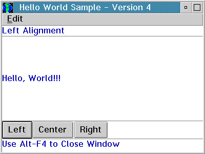
The Hello World version 4 application defines three push buttons (Left, Center, and Right) in the ahellow4.cpp file.
The command events generated by pressing the Left, Center, and Right push buttons are handled by the AHelloWindow::command member function. Note, the command events are the same as those used for the corresponding menu items. Therefore, the command function processing is the same whether you press the push button or select the item on the menu bar.
The following figure shows the Hello World version 4 push buttons:
Creating a Radio Button
A radio button is a window with text displayed to the right of a small circular indicator. Use radio buttons to display a set of choices from which the user can select one. Each time the user selects a radio button, that button's state toggles between selected and unselected. This state remains until the next time the user selects the button. An application typically uses radio buttons in groups.
A group of radio buttons contains at least two radio buttons. Within a group, usually one button is selected by default. The user can move the selection to another button by using the cursor keys; however, only one button can be selected at a time. Radio buttons are appropriate if an exclusive choice is required from a fixed list of options. For example, applications often use radio buttons to let users select the screen foreground and background colors.
The IRadioButton class lets you create and manage the radio button window. The ISelectHandler class processes the selection of a radio button. You add the handler to either the radio button or its owner window by calling the handler's handleEventsFor function.
See Adding Events and Event Handlers for information about event handlers.
The following example creates a group of radio buttons.
- The text associated with each radio button is defined in
the resource file as string text, as follows:
STRINGTABLE BEGIN STR_BLACK, "Black" STR_WHITE, "White" STR_BLUE, "Blue" STR_RED, "Red" STR_YELLOW, "Yellow" END - Declare the radio buttons in the .hpp file as follows:
/***********************************************************/ /* Command handler class declaration */ /***********************************************************/ class MyCommandHandler : public ICommandHandler { public: MyCommandHandler(AppWindow *mainWindow); protected: virtual bool command(ICommandEvent& cmdEvent); private: AppWindow *appWindow; }; /***********************************************************/ /* Select handler class declaration */ /***********************************************************/ class MySelectHandler: public ISelectHandler { public: MySelectHandler(IStaticText *info); protected: selected(IControlEvent& evt); private: bool fProcess; IStaticText *sttxt; }; /***********************************************************/ /* AppWindow declaration */ /***********************************************************/ class AppWindow : public IFrameWindow { public: AppWindow( unsigned long windowId); ~AppWindow(); AppWindow & enableButton(); AppWindow & disableButton(); private: ITitle * title; ICanvas * canvas1; IGroupBox * groupBox; IStaticText * staticText; IRadioButton * white; IRadioButton * black; IRadioButton * blue; IRadioButton * red; IRadioButton * yellow; MySelectHandler * selectHandler; MyCommandHandler * commandHandler; }; - Declare the buttons in the .cpp file as follows:
AppWindow :: AppWindow( unsigned long windowId) : IFrameWindow(windowId, defaultStyle() | menuBar) { //********************************************************* // Create Title //********************************************************* title = new ITitle(this,ID_RADIO_TITLE); //********************************************************* // Create Canvas //********************************************************* canvas1 = new ICanvas(ID_CANVAS, this, this); moveSizeTo(IRectangle(10,10,650,540)); setClient(canvas1); IWindow * pParent= canvas1; IWindow * pOwner = canvas1; //********************************************************* // Create Status Area //********************************************************* sttxt = new IStaticText(ID_TEXT, canvas1, canvas1, IRectangle(20,425,470,450)); sttxt->setText(ID_STAT_TITLE); //********************************************************* // Create Group Box //********************************************************* groupBox = new IGroupBox(ID_GROUPBOX, canvas1, canvas1, IRectangle( 90,10,610,400)); groupBox->setText("Color Selection"); //********************************************************* // Create Radio Buttons //********************************************************* white = new IRadioButton(WND_WHITEBT, pParent, pOwner, IRectangle(100,300,250,360)); white->setText(STR_WHITE); black = new IRadioButton(WND_BLACKBT, pParent, pOwner, IRectangle(100,230,250,290)); black->setText(STR_BLACK); blue = new IRadioButton(WND_BLUEBT, pParent, pOwner, IRectangle(100,160,250,220)); blue->setText(STR_BLUE); red = new IRadioButton(WND_REDBT, pParent, pOwner, IRectangle(100,90,250,150)); red->setText(STR_RED); yellow = new IRadioButton(WND_YELLOWBT, pParent, pOwner, IRectangle(100,20,250,80)); yellow->setText(STR_YELLOW); //********************************************************* // Set the group style of the controls //********************************************************* white->enableGroup().enableTabStop(); //********************************************************* // Select white as the default button //********************************************************* white->select(); //********************************************************* // Set the select handler to handle events //********************************************************* selectHandler = new MySelectHandler(sttxt); selectHandler->handleEventsFor(white); selectHandler->handleEventsFor(black); selectHandler->handleEventsFor(blue); selectHandler->handleEventsFor(red); selectHandler->handleEventsFor(yellow); //********************************************************* // Set the command handler to handle menu events //********************************************************* commandHandler = new MyCommandHandler(this); commandHandler->handleEventsFor(this); setFocus().show(); } - Process selection events in the select handler routines
as follows:
/***********************************************************/ /* MyWindow Select Event Handler */ /***********************************************************/ MySelectHandler::MySelectHandler(IStaticText *info) :ISelectHandler(), staticText(info) { } /***********************************************************/ /* Set static text when radio button selected. */ /***********************************************************/ bool MySelectHandler::selected(IControlEvent& evt) { bool fprocess = false; switch(evt.controlId()) { case WND_BLACKBT: staticText->setText("Black is the currently selected color"); fProcess=false; break; case WND_WHITEBT: staticText->setText("White is the currently selected color"); fProcess=false; break; case WND_REDBT: staticText->setText("Red is the currently selected color"); fProcess=false; break; case WND_BLUEBT: staticText->setText("Blue is the currently selected color"); fProcess=false; break; case WND_YELLOWBT: staticText->setText("Yellow is the currently selected color"); fProcess=false; break; } return fProcess = false; } - Process menu events in the command handler routines as
follows:
/*************************************************************/
/* Enable the radio button                                   */
/*************************************************************/
AppWindow & AppWindow::enableButton()
{
  blue->enable();
  return (*this);
}

/*************************************************************/
/* Disable the radio button                                  */
/*************************************************************/
AppWindow & AppWindow::disableButton()
{

   blue->disable();
   return (*this);
}

/*************************************************************/
/* Construct the command handler                             */
/*************************************************************/
MyCommandHandler::MyCommandHandler(AppWindow *mainWindow)
{
  appWindow = mainWindow;
}

/*************************************************************/
/* MyWindow command event handler                            */
/*************************************************************/
bool MyCommandHandler :: command(ICommandEvent& cmdevt)
 {
   switch (cmdevt.commandId())
   {
      case ID_DISABLE_BLUE_BTN:
        appWindow->disableButton();
          break;
      case ID_ENABLE_BLUE_BTN:
        appWindow->enableButton();
          break;
      return true;
   }
   return false;
}
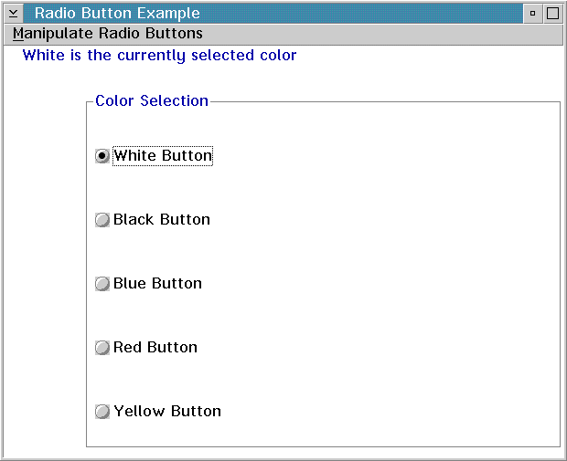
The following figure shows the radio buttons created with the preceding code example:
Creating a Check Box
Check boxes are similar to radio buttons, except that they can offer multiple-choice selection, as well as individual choice.

When a user selects the choice, a check mark symbol (&check.) appears in the check box to indicate that the choice is selected.
When a user selects the choice, the check box is filled in to indicate that the choice is selected.
By selecting the choice again, the user deselects the check box. Use a check box to set a choice in a group of choices that are not mutually exclusive.
Check boxes also toggle application features on or off. For example, a word processing application might use a check box to let the user turn word wrapping on or off.
The ICheckBox class lets you create and maintain a check box. The selection of a check box is processed by using the ISelectHandler class. You add the handler to either the check box or its owner window.
The following example shows you how to create a check box.
- Create a check box by first making a declaration in the
.hpp file, as follows:
/***********************************************************/ /* Set canvas class declaration */ /***********************************************************/ class MySet : public ISetCanvas { public: MySet(unsigned long winId, IWindow* pParent); private: ICheckBox check1; ICheckBox check2; ICheckBox check3; }; /***********************************************************/ /* Application Window declaration */ /***********************************************************/ class AppWindow : public IFrameWindow { public: AppWindow( unsigned long windowId); ~AppWindow(); private: ITitle title; MySet * pSetCv; IMultiCellCanvas canvas; }; - Construct the frame window:
/*************************************************************/ /* Window Constructor */ /*************************************************************/ AppWindow :: AppWindow( unsigned long windowId) : IFrameWindow(windowId, defaultStyle()), title(this,PSZ_OBJECT,PSZ_VIEW), canvas(ID_CANVAS, this, this) { setClient(&canvas); //********************************************************* // Create Canvas //********************************************************* pSetCv = new MySet(ID_SET, &canvas); canvas.addToCell(pSetCv, 2, 2); } - Construct the check boxes as shown here:
/***********************************************************/
/* MySet constructor                                       */
/***********************************************************/
MySet :: MySet(unsigned long winId, IWindow* pParent)
 : ISetCanvas(winId, pParent, pParent),
   check1(ID_BOX1, this, this, IRectangle(),
                       ICheckBox::classDefaultStyle |
                       IWindow::group),
   check2(ID_BOX2, this, this),
   check3(ID_BOX3, this, this)
{
   check1.setText(PSZ_BOX1);
   check2.setText(PSZ_BOX2);
   check3.setText(PSZ_BOX3);
   setBorderText(IResourceId(PSZ_GROUP));
}
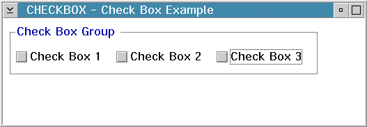
The following figure shows the check boxes created using the preceding example:
Creating a Three-State Check Box
Three-state check boxes are similar to check boxes, except that they can be displayed in halftone as well as selected and unselected. An application might use the halftone state to indicate that, currently, the check box is not selectable. This control is not supported on Motif. The selection of a three-state check box is processed by using the ISelectHandler class and adding the handler to either the three-state check box or its owner window.
If a three-state check box is selected, it can be either checked or halftoned. You have to use a combination of the isSelected and isHalftone member functions to determine the state of a three-state check box. The following table shows the state of the three-state check box and its relation to the isSelected and isHalftone member functions.
| Current State |
isSelected |
isHalftone |
|
|---|---|---|---|
| checked | true | false | |
| halftone | true | true | |
| not checked | false | false |
The following example shows how to create a three-state check box:
I3StateCheckBox three(ID_THREE, &canvas, &canvas,
                      IRectangle(100,220,250,280));
three.setText("3 State");

three.selectHalftone();

if (three.isSelected())  {      // Determine state of the button
   if (three.isHalftone())  {
      // is halftone
   } else {
      // is checked
   }  /* end if */
} else {
   // is not selected
}  /* end if */
Adding Events and Event Handlers
Using List and Slider Controls
IClipboard
IOutlineBox
IGroupBox
IStaticText
IEntryField
IMultiLineEdit
IPushButton
IRadioButton
ICheckBox
IBaseListBox
IBaseComboBox
IBaseSpinButton
