You can use lists and sliders in your Open Class Library application by including the following controls:
You can use a list box to display a list in a window. Notification messages are sent from the list box to its owner window, enabling the application to respond to user actions in the list. Events are routed first to the list box, then to its owner.
Once you create the list box, your application controls the inserting and deleting of list items. Items can be inserted at the end of the list, automatically sorted into the list, or inserted at a specified index or cursor position. You can add an array of items at a specified index or cursor position.
You can attach an ISelectHandler to a list box or its owner window to process events created when the user selects or double-clicks on an item in the list box. Typically, the owner is a dialog window or the client window of an application frame window.
For an ICollectionViewListBox list box, the inserting, sorting, and deleting actions occur on the collection.
You can use cursors to manipulate the list box. Cursors can be filters to process all items in the list box or only the selected ones.
This section shows you how to create an IListBox list box control. The sample comes from Hello World version 5. It does the following:
This code comes from the ahellow5.cpp file:
 ,listBox(WND_LISTBOX, &clientWindow, &clientWindow, IRectangle(),
              IListBox::defaultStyle() |
              IWindow::tabStop |
              IListBox::noAdjustPosition)
:
:
/************************************************/
/* Add items to the list box                    */
/************************************************/

for (int i=0;i<HI_COUNT;i++ )
   listBox.addAscending(HI_WORLD+i);
selectHandler.handleEventsFor(&listBox);

:
:
/************************************************/
/* Create a cursor                              */
/************************************************/
IListBox::Cursor lbCursor(listBox);
lbCursor.setToFirst();
/*************************************************/
/* Set the text to the first item in the list box*/
/*************************************************/
hello.setText(listBox.elementAt(lbCursor));
Your applications can add or delete an item in a list box. Items in a list are specified with a 0-based index (beginning at the top of the list). A new list is created empty; then, the application initializes the list by inserting items.
The application specifies the text and position for each new item. It can specify an absolute-position index or use a list box cursor.
For an ICollectionViewListBox control, the list box control window reflects actions on the associated collection. So an element removed from the collection will be visually reflected in the list box control.
The following example shows you how to create an IListBox list box control and then add and delete items. This declaration shows a frame window that has a list box.
class Frame : public IFrameWindow
{
 public:
    Frame(unsigned long windowId);
    ~Frame();
    void handleEvent(unsigned long int);

 private:
    ITitle              title;
    ICanvas             canvas;
    IEntryField         ef;
    IListBox            listbox;
    IStaticText         stTxt1;
    IStaticText         stTxt2;
    ACommandHandler   * commandHandler;
};
/***********************************************************/
/* Construct the frame window                              */
/***********************************************************/
Frame::Frame(unsigned long windowId)
   : IFrameWindow(windowId,
                  IFrameWindow::defaultStyle() |
                  IFrameWindow::menuBar),
     title(this,"List Box Example"),
     ef(ID_ENTRY,          this, this, IRectangle()),
     listbox(ID_LISTBOX,   this, this, IRectangle(),
              (IListBox::defaultStyle()
              | IListBox::multipleSelect)
              & ~IListBox::horizontalScroll),

     stTxt1(ID_STTXT1,     this, this),
     stTxt2(ID_STTXT2,     this, this)
 {
ACommandHandler::ACommandHandler(Frame *listWindow)
{
  list = listWindow;
}


void Frame :: handleEvent(unsigned long int eventtype)
 {
  switch (eventtype)
  {
// Add item to listbox
    case ID_ADD_ITEM:
      if (!ef.isEmpty()) {
        listbox.addAsFirst(ef.text());
        ef.setText("");
      }
     break;
// Add item in ascending order to list box
    case ID_ASC_ITEM:
      if (!ef.isEmpty()) {
        listbox.addAscending(ef.text());
        ef.setText("");
      }
     break;

// Add item in descending order to list box
    case ID_DESC_ITEM:
      if (!ef.isEmpty()) {
        listbox.addDescending(ef.text());
        ef.setText("");
      }
     break;

// Delete selected item(s) from list box
    case ID_DEL_ITEM:
      {
        IListBox::Cursor lbc(listbox, IListBox::Cursor::selectedItems);
        for (lbc.setToFirst(); lbc.isValid(); lbc.setToFirst()) {
          listbox.removeAt(lbc);
        }
      }
     break;

// Delete all items from list box
    case ID_DELALL_ITEM:
      if (!listbox.isEmpty()) {
        listbox.removeAll();
      }
     break;

// Allow only single selection in list box
    case ID_SINGLE_ITEM:
      listbox.disableMultipleSelect();
      listbox.disableExtendedSelect();
     break;

// Allow multiple selection in list box
    case ID_MULTI_ITEM:
      listbox.disableExtendedSelect();
      listbox.enableMultipleSelect();
     break;

    case ID_EXTEND_ITEM:
      listbox.disableMultipleSelect();
      listbox.enableExtendedSelect();
     break;

 } // end of switch

}

bool ACommandHandler::command(ICommandEvent& cmdEvent)
{
  switch (cmdEvent.commandId())
  {
    case ID_ADD_ITEM:
    case ID_ASC_ITEM:
    case ID_DESC_ITEM:
    case ID_DEL_ITEM:
    case ID_DELALL_ITEM:
    case ID_SINGLE_ITEM:
    case ID_MULTI_ITEM:
    case ID_EXTEND_ITEM:
     list->handleEvent(cmdEvent.commandId());
   return true;
 } // end of switch
 return false;
}
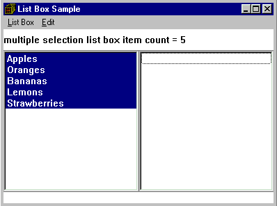
The following figure shows the list box created with the preceding code example:
This section shows you how to create a combination box control. The code comes from the Hello World version 6 sample application. The adialog6.cpp file does the following:
,textField( DID_ENTRY,&clientCanvas,&clientCanvas
   ,IRectangle(), IWindow::visible|IComboBox::dropDownType)
for (int i=0;i<HI_COUNT;i++ )
   textField.addAscending(HI_WORLD+i);
textField.setText(saveText);
textField.disableAutoScroll().enableMargin().enableTabStop();
saveText = textField.text();
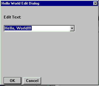
The following shows the Hello World version 6 combination box control:
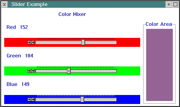
The following example is comprised of three sliders used to set the red, green, and blue colors in a color mixer. As the slider arm moves, the static text color changes appropriately.
class ColorMixerWindow : public IFrameWindow   {   public:
    ColorMixerWindow();
    ~ColorMixerWindow();
    ColorMixerWindow& displayNewColor();

 private:
    IMultiCellCanvas  canvas;
    ISlider           redSlider, greenSlider, blueSlider;
    IMultiCellCanvas  colorAreaCanvas;
    ISetCanvas        colorAreaFrame;
    IStaticText       colorArea;
    ColorMonitor      colorMonitor;
    ISetCanvas        redTitleCanvas, greenTitleCanvas, blueTitleCanvas;
    IStaticText       redTitle, greenTitle, blueTitle;
    IStaticText       redValue, greenValue, blueValue;
    IStaticText       mixerTitle;
  };
class ColorMonitor : public IEditHandler

  {
  public:
    ColorMonitor( ColorMixerWindow *colorMixerWindow )
      : _colorMixerWindow( colorMixerWindow )
      {;}

  protected:
    bool edit( IControlEvent &event );

  private:
    ColorMixerWindow *_colorMixerWindow;
  };
ColorMixerWindow::ColorMixerWindow( )
  : IFrameWindow("Slider Example" )
  , canvas( ID_MCCANVAS, this, this )
  , mixerTitle( ID_MIXER_TITLE, &canvas, &canvas )
  , redTitleCanvas( ID_RED_CANVAS, &canvas, &canvas )
  , redValue( ID_RED_VALUE, &redTitleCanvas, &redTitleCanvas )
  , redTitle( ID_RED_TITLE, &redTitleCanvas, &redTitleCanvas )
  , redSlider(ID_RED_SLIDER, &canvas, &canvas, IRectangle(), 256, 0,
    ISlider::pmCompatible |
    ISlider::homeLeft | ISlider::horizontal | ISlider::primaryScale1 |
    ISlider::alignCentered | ISlider::buttonsLeft | IWindow::visible )
  , greenTitleCanvas( ID_GREEN_CANVAS, &canvas, &canvas )
  , greenValue( ID_GREEN_VALUE, &greenTitleCanvas, &greenTitleCanvas )
  , greenTitle( ID_GREEN_TITLE, &greenTitleCanvas, &greenTitleCanvas )
  , greenSlider(ID_GREEN_SLIDER, &canvas, &canvas, IRectangle(), 256. 0,
    ISlider::pmCompatible |
    ISlider::homeLeft | ISlider::horizontal | ISlider::primaryScale1 |
    ISlider::alignCentered | ISlider::buttonsLeft | IWindow::visible )
  , blueTitleCanvas( ID_BLUE_CANVAS, &canvas, &canvas )
  , blueValue( ID_BLUE_VALUE, &blueTitleCanvas, &blueTitleCanvas )
  , blueTitle( ID_BLUE_TITLE, &blueTitleCanvas, &blueTitleCanvas )
  , blueSlider(ID_BLUE_SLIDER, &canvas, &canvas, IRectangle(), 256, 0,
    ISlider::pmCompatible |
    ISlider::homeLeft | ISlider::horizontal | ISlider::primaryScale1 |
    ISlider::alignCentered | ISlider::buttonsLeft | IWindow::visible )
  , colorAreaCanvas( ID_COLOR_CANVAS, &canvas, &canvas )
  , colorAreaFrame( ID_COLOR_FRAME, &colorAreaCanvas, &colorAreaCanvas )
  , colorArea( ID_COLOR_AREA, &colorAreaCanvas, &colorAreaCanvas )
  , colorMonitor( this )

  {
| Note: | The tick spacing defaults to 0 so the slider is automatically sized to the width of the control window. |
// Put a border of 10 around the sliders
  canvas
    .setColumnWidth(1, 10 )
    .setColumnWidth(5, 10 )
    .setRowHeight( 1, 10 )
    .setRowHeight( 15, 10 )
  // Mark the column that contains the sliders as expandable.
    .setColumnWidth(2, 10,true);

  mixerTitle
    .setText( "Color Mixer" )
    .setAlignment( IStaticText::centerCenter );

  // Set up the sliders to have a range of 0 to 255 for color selection
  redSlider
    .setTickText(0, "0")
    .setTickText(255, "255")
    .moveArmToTick( 0 );
  redTitle.setText("Red");
  redValue
    .setText("0")
    .setLimit( 3 );
  redTitleCanvas
    .setDeckOrientation( ISetCanvas::horizontal )
    .setPackType( ISetCanvas::tight );

  greenSlider
    .setTickText(0, "0")
    .setTickText(255, "255")
    .moveArmToTick( 0 );
  greenTitle.setText("Green");
  greenValue
    .setText("0")
    .setLimit( 3 );
  greenTitleCanvas
    .setDeckOrientation( ISetCanvas::horizontal )
    .setPackType( ISetCanvas::tight );

  blueSlider
    .setTickText(0, "0")
    .setTickText(255, "255")
    .moveArmToTick( 0 )
    .setForegroundColor(IColor::white );
  blueTitle.setText("Blue");
  blueValue
    .setText("0")
    .setLimit( 3 );
  blueTitleCanvas
    .setDeckOrientation( ISetCanvas::horizontal )
    .setPackType( ISetCanvas::tight );

  // Set each slider's background to the color that the slider
  // represents.
  redSlider.setBackgroundColor   ( IColor::red );
  greenSlider.setBackgroundColor( IColor::green );
  blueSlider.setBackgroundColor  ( IColor::blue );

  // Add a ISetCanvas to the multicell canvas and use its text feature to
  // put a border around the colorArea. The IFont for the colorAreaFrame is
  // used to figure out the size of the first row.
  IFont colorAreaFont( &colorAreaFrame );
  colorAreaCanvas
    .addToCell( &colorAreaFrame, 1, 1, 3, 3 )
    .addToCell( &colorArea, 2, 2 )
    .setColumnWidth( 2, 10, true )
    .setRowHeight( 1, 5 + colorAreaFont.maxCharHeight() )
    .setRowHeight( 2, 10, true );

  colorAreaFrame.setBorderText("Color Area");

  // Set the slider visible ticks to be every 5th one.
  for ( int i = 0; i <= 255; i=i+5 )
    {
    redSlider.setTickLength  ( i, 10 );
    greenSlider.setTickLength( i, 10 );
    blueSlider.setTickLength ( i, 10 );
    }

  // Add the controls to the multicell canvas.
  canvas
    .addToCell( &mixerTitle,       2, 2 )
    .addToCell( &redTitleCanvas,   2, 4 )
    .addToCell( &redSlider,        2, 6 )
    .setRowHeight( 6, 10, true )
    .addToCell( &greenTitleCanvas, 2, 8 )
    .addToCell( &greenSlider,      2, 10)
    .setRowHeight( 10, 10, true )
    .addToCell( &blueTitleCanvas,  2, 12)
    .addToCell( &blueSlider,       2, 14)
    .setRowHeight( 14, 10, true )
    .addToCell( &colorAreaCanvas,   4, 4, 1, 11);

  // Add the colorMonitor to each slider so that we can detect when
  // to update the colorArea.
  colorMonitor
    .handleEventsFor( &redSlider )
    .handleEventsFor( &blueSlider )
    .handleEventsFor( &greenSlider );

  // Initialize the color areas color.
  colorArea.setBackgroundColor( IColor( 0, 0, 0 ));
  setClient(&canvas);
  }
ColorMixerWindow& ColorMixerWindow::displayNewColor()

  {
  // Use the armTickOffset of each of the sliders to create an IColor
  // object to use to set the background color of the colorArea.
  IColor newColor( redSlider.armTickOffset(),
                   greenSlider.armTickOffset(),
                   blueSlider.armTickOffset() );
  colorArea.setBackgroundColor( newColor );

  // Display the value used to create the colorArea's background color.
  redValue.setText  ( IString( redSlider.armTickOffset())   );
  greenValue.setText( IString( greenSlider.armTickOffset()) );
  blueValue.setText ( IString( blueSlider.armTickOffset())  );

  return *this;
  }
bool ColorMonitor::edit( IControlEvent& event )

  {
  // When the slider's value changes display a new background color in the
  // colorArea.
  _colorMixerWindow->displayNewColor();
  return true;
  }
The following figure shows the slider created by the preceding example:
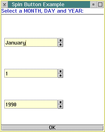
The following example shows you how to create three spin buttons to show the three parts of a date (month, day, and year). It demonstrates how to initialize the data of both a text spin button and a numeric spin button. It also shows how to retrieve the value of the spin buttons and show the values in a message box. The spin buttons are children of the client canvas. The frame also contains a status area and a push button. The push button is added as an extension below the client canvas.
/***********************************************************/
/* Declare the frame window                                */
/***********************************************************/
class AppWindow : public IFrameWindow {
 public:
    AppWindow(unsigned long windowId);
    ~AppWindow();
    ITextSpinButton     * spinbtn1;
    INumericSpinButton  * spinbtn2,
                        * spinbtn3;
    IStaticText           statusarea;
    IPushButton           pushbtn;
    void eventHandle();

 private:
    ITitle          title;
    ICanvas         canvas;
    ACommandHandler * commandHandler
/***********************************************************/
/* Create the frame window                                 */
/***********************************************************/
AppWindow::AppWindow(unsigned long windowId)
   : IFrameWindow(windowId,
     IFrameWindow::defaultStyle()),
     title(this, "Spin Button Example"),
     canvas(WID_CANVAS, this, this, IRectangle(5, 5, 410, 460)),
     statusarea(WID_STATUS, this, this),
     pushbtn(WID_BUTTON, this, this)

{
// Customize the push button with text
pushbtn.setText("OK");

//Create month spin button (text type spin button)
spinbtn1 = new ITextSpinButton(WID_MONTH,&canvas, &canvas,
                               IRectangle(10,250,200,350));

//Create day spin button (numeric type spin button)
spinbtn2 = new INumericSpinButton(WID_DAY,&canvas, &canvas,
                                  IRectangle(10,150,200,240 ));

//Create year spin button (numeric type spin button)
spinbtn3 = new INumericSpinButton(WID_YEAR,&canvas, &canvas,
                                  IRectangle(10,50,200,140 ));
const int kArraySize = 12;
const int daySize = 31;
const int yearSize = 2000;

const char* textArray[kArraySize] = { "January", "February", "March",
       "April", "May","June", "July", "August", "September", "October",
       "November", "December" };

// Add month data to spin button
for ( int i = 0; i < kArraySize; i++ )
      spinbtn1->addAsLast( textArray[i]);

// Set range of days to day spin button
spinbtn2->setRange( IRange( 1, daySize ) );

// Set range of years to year spin button (1990 - 2000)
spinbtn3->setRange( IRange( 1990, yearSize ) );

//Add the status area as an extension
statusarea.setText("Select a MONTH, DAY and YEAR:");
setClient(&canvas);

addExtension(&statusarea, IFrameWindow::aboveClient,
     .05, IFrameWindow::thickLine);

//Add the push button as an extension
addExtension(&pushbtn, IFrameWindow::belowClient,
     .05, IFrameWindow::thickLine);

//Add the command handler
commandHandler = new ACommandHandler(this);
commandHandler->handleEventsFor(this);
}
void AppWindow :: eventHandle()
 {
  IString month = spinbtn1->text() += " ";
  IString day   = spinbtn2->value();
  IString year  = spinbtn3->value();
  IString text  = "You have selected: ";
  IString date  = text += month;
  date += day;
  date += " ";
  date += year;

// Display the data retrieved from the spin buttons
   IMessageBox msg(IWindow::desktopWindow());
   msg.setTitle("Spin Buttons Selection Notifier");
   msg.show(date, IMessageBox::informationIcon | IMessageBox::okButton)


  return;
 }

//*****************************************************************************
// ACommandHandler::ACommandHandler                                           *
//   Construct the command handler from a pointer to the main window          *
//   that events will be handled for.                                         *
//*****************************************************************************
ACommandHandler::ACommandHandler(AppWindow *pushWindow)
{
  push = pushWindow;
}

//*****************************************************************************
// ACommandHandler::command                                                   *
//   Handle menu commands                                                     *
//*****************************************************************************
bool ACommandHandler::command(ICommandEvent & cmdEvent)
{
  bool eventProcessed(true);

// When OK push button is pressed - display the data inside the
// spin buttons
  switch (cmdEvent.commandId())
  {
    case WID_BUTTON:
      push->eventHandle();
      break;
    default:
     eventProcessed = false;
  }
 return true;
}
The following figure shows the spin buttons created using the preceding example:
Creating and Using Text Controls
Creating a Frame Window
Layout Using Canvas Controls
ICanvas
ICircularSlider
IComboBox
IListBox
INumericSpinButton
IProgressIndicator
IPushButton
ISlider
IStaticText
ITextSpinButton
