The toolbar is essentially a frame extension with buttons that represent common actions. You can add both fly-over help and drag-and-drop support on the toolbar. You can use the direct manipulation support to rearrange the toolbar buttons within an application or add new buttons from a menu (PM only).
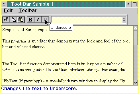
The following figure shows an example of a tool bar.
This figure is created using the sample code found in the ibmcppw\samples\ioc\tbar1 directory.
You can construct objects from the IToolBar class in the following ways:
        IToolBar ( unsigned long          identifier,
           IFrameWindow*          owner,
           Location               location = aboveClient,
           bool                   groupWithPreceding = false,
           const Style&           style=defaultStyle());
        IToolBar ( unsigned long          identifier,
                   IToolBar*              precedingToolBar,
                   bool                   groupWithPreceding = false,
                   const Style&           style=defaultStyle());
When you create an object from the IToolBarButton class, you can use a standard format to ensure that all your buttons have the same common appearance. Standard formatting controls the amount of area occupied by the bitmap (when visible) and the amount of area occupied by text (when visible). Standard formatting affects all of the toolbar buttons that have a style of IToolBarButton::standardFormat. The Open Class Class Library takes advantage of the standard formatting of toolbar buttons when painting the button. This therefore improves the performance.
The nested classes IToolBar::Style and IToolBarButton::Style provide a set of valid styles you can use upon construction for objects of the class.
The following example shows a customized toolbar that implements fly-over help, direct manipulation support, and floating toolbars. This sample is found in the ibmcppw\samples\ioc\tbar2 directory.
First, we do the following in the .hpp file:
114  //-------------------------------------------------------------------
115  // Editor
116  //
117  // This class is the main window of the sample problem.  It is
118  // responsible for creating and managing all of the windows that
119  // are used.
120  //-------------------------------------------------------------------
121  class Editor : public IFrameWindow
122  {
123  public:
124    Editor();
125
126  EditorMLE
127   &editorWindow ( ) { return editWindow; }
128
129  IFont
130   &editorFont ( ) { return editFont; }
131
132  Editor
133   &updateFontToolBar ( );
134
135  IToolBar
136   &toolBar ( unsigned long id );
137
138  private:
139    ITitle
140      title;
141    IToolBar
142      fileToolBar,
143      editToolBar,
144      fontToolBar;
145  IFlyText
146    flyText;
147  IStaticText
148    infoText;
149  IFlyOverHelpHandler
150    flyHelpHandler;
151  EditorMLE
152    editWindow;
153  EditorCommandHandler
154    commandHandler;
155  FontSelectHandler
156    fontSelectHandler;
157  IToolBarButton
158    openButton,
159    saveButton,
160    cutButton,
161    copyButton,
162    pasteButton,
163    boldButton,
164    italicButton,
165    underscoreButton;
166  IComboBox
167    fontCombo;
168  IMenuBar
169    menu;
170  IFont
171    editFont;
172  IWindow
173    *fileSubmenu,
174    *editSubmenu;
175  };
176
177  //-------------------------------------------------------------------
178  // ToolBarNotebook
179  //-------------------------------------------------------------------
180  class ToolBarNotebook : public IFrameWindow
181  {
182  public:
183    ToolBarNotebook ( Editor&   editor );
184  private:
185  Editor
186    &editorFrame;
187  INotebook
188    notebook;
189  };
190

In the .cpp file we then do the following:
59 /******************************************************************************
60 * main - creates and shows the editor window *
61 ******************************************************************************/
62
63 int main()
64 {
65 ICoordinateSystem::setApplicationOrientation(
66 ICoordinateSystem::originLowerLeft );
67 Editor editor;
68 editor.show();
69 editor.setFocus();
70 IApplication::current().run();
71 return 0;
72 }
73
74 /******************************************************************************
75 * Class Editor::Editor - Constructor for the editor window *
76 ******************************************************************************/
77 Editor::Editor ()
78 : IFrameWindow(ID_MAIN_WINDOW)
79 , title(this)
80 , fileToolBar(ID_FILE, this)
81 , editToolBar(ID_EDIT, &fileToolBar, true)
82 , fontToolBar(ID_FONT, &editToolBar, true)
83 , flyText(ID_FLYTEXT, this)
84 , infoText(ID_INFOTEXT, this, this)
85 , flyHelpHandler(&flyText, &infoText, 0, 0)
86 , editWindow(ID_EDITOR, *this)
87 , commandHandler(*this)
88 , fontSelectHandler(*this)
89 , openButton(IC_ID_OPEN,&fileToolBar, &fileToolBar)
90 , saveButton(IC_ID_SAVE,&fileToolBar, &fileToolBar)
91 , cutButton(IC_ID_CUT,&editToolBar, &editToolBar)
92 , copyButton(IC_ID_COPY,&editToolBar, &editToolBar)
93 , pasteButton(IC_ID_PASTE,&editToolBar, &editToolBar)
94 , boldButton(IC_ID_BOLD,&fontToolBar, &fontToolBar,
95 IRectangle(), IToolBarButton::defaultStyle() |
96 IToolBarButton::noDragDelete )
97 , italicButton(IC_ID_ITALIC, &fontToolBar, &fontToolBar,
98 IRectangle(), IToolBarButton::defaultStyle() |
99 IToolBarButton::noDragDelete )
100 , underscoreButton(IC_ID_UNDERSCORE, &fontToolBar, &fontToolBar,
101 IRectangle(), IToolBarButton::defaultStyle() |
102 IToolBarButton::noDragDelete )
103 , fontCombo(ID_FONTCOMBO, &fontToolBar, &fontToolBar, IRectangle(),
104 IComboBox::classDefaultStyle &~IComboBox::simpleType |
105 IComboBox::readOnlyDropDownType)
106 , menu(ID_MAIN_WINDOW,this)
107 , editFont()
108 {
109 /*-----------------------------------------------------------------------------|
110 | Set the icon and the title |
111 ------------------------------------------------------------------------------*/
112 setIcon( id() );
113 title.setTitleText(ID_MAIN_WINDOW);
114
115 /*-----------------------------------------------------------------------------|
116 | Add buttons to the file toolbar |
117 ------------------------------------------------------------------------------*/
118 fileToolBar.addAsLast(&openButton,true)
119 .addAsLast(&saveButton);
120
121 /*-----------------------------------------------------------------------------|
122 | Add buttons to the edit toolbar |
123 ------------------------------------------------------------------------------*/
124 editToolBar.addAsLast(&cutButton,true)
125 .addAsLast(©Button)
126 .addAsLast(&pasteButton);
127
128 /*-----------------------------------------------------------------------------|
129 | Add buttons to the font toolbar |
130 ------------------------------------------------------------------------------*/
131 fontToolBar.addAsLast(&boldButton,true)
132 .addAsLast(&italicButton)
133 .addAsLast(&underscoreButton)
134 .addAsLast(&fontCombo,true);
135
136 /*-----------------------------------------------------------------------------|
137 | Set up the latchabable style for font property buttons |
138 ------------------------------------------------------------------------------*/
139 boldButton.enableLatching();
140 italicButton.enableLatching();
141 underscoreButton.enableLatching();
142
143 /*-----------------------------------------------------------------------------|
144 | Load up front combo box with face names |
145 ------------------------------------------------------------------------------*/
146 fontCombo.setLimit(10);
147 IFont::FaceNameCursor fontCursor;
148 for ( fontCursor.setToFirst(); fontCursor.isValid(); fontCursor.setToNext())
149 {
150 IString faceName = IFont::faceNameAt(fontCursor);
151 fontCombo.addAsLast(faceName);
152 if (faceName.length() > fontCombo.limit())
153 fontCombo.setLimit(faceName.length());
154 }
155 updateFontToolBar();
156
157 /*-----------------------------------------------------------------------------|
158 | Set up titles for toolbars when floating |
159 ------------------------------------------------------------------------------*/
160 fileToolBar.setFloatingTitle(ID_FILE);
161 editToolBar.setFloatingTitle(ID_EDIT);
162 fontToolBar.setFloatingTitle(ID_FONT);
163
164 /*-----------------------------------------------------------------------------|
165 | Setup the editor |
166 ------------------------------------------------------------------------------*/
167 setClient(&editWindow);
168 editWindow.setFont(editFont);
169 editWindow.importFromFile("toolbar2.not");
170 editWindow.setTop(1);
171
172 /*-----------------------------------------------------------------------------|
173 | Add the info frame extension |
174 ------------------------------------------------------------------------------*/
175 addExtension(&infoText, IFrameWindow::belowClient);
176
177 /*-----------------------------------------------------------------------------|
178 | Set up and add the help handler |
179 ------------------------------------------------------------------------------*/
180 flyHelpHandler.setLongStringTableOffset(OFFSET_INFOTEXT);
181 flyHelpHandler.setDefaultText("\0");
182 flyHelpHandler.handleEventsFor(&fileToolBar);
183 flyHelpHandler.handleEventsFor(&editToolBar);
184 flyHelpHandler.handleEventsFor(&fontToolBar);
185
186 /*-----------------------------------------------------------------------------|
187 | Attach the Command Handler to frame and toolbar |
188 ------------------------------------------------------------------------------*/
189 commandHandler.handleEventsFor(this);
190 commandHandler.handleEventsFor(&fileToolBar);
191 commandHandler.handleEventsFor(&editToolBar);
192 commandHandler.handleEventsFor(&fontToolBar);
193
194 /*-----------------------------------------------------------------------------|
195 | Add the handler to change the font |
196 ------------------------------------------------------------------------------*/
197 fontSelectHandler.handleEventsFor(&fontCombo);
198
199 /*-----------------------------------------------------------------------------|
200 | Set up drag from menu |
201 ------------------------------------------------------------------------------*/
202 fileSubmenu = new ISubmenu( menu.menuItem(ID_FILE).submenuHandle() );
203 IDMHandler::enableDragFrom( fileSubmenu );
204 editSubmenu = new ISubmenu( menu.menuItem(ID_EDIT).submenuHandle() );
205 IDMHandler::enableDragFrom( editSubmenu );
206
207 moveSizeToClient(IRectangle(IPoint(100,100),
208 ISize(editFont.avgCharWidth()*80,
209 editFont.maxCharHeight()*15)));
210 }
The resulting MLE and toolbars are displayed below.
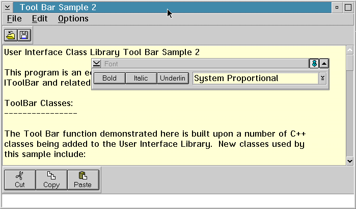
You can use the settings notebook to chose where the toolbar appears and what appears on each toolbar button. In the preceding figure, there are three toolbars with different tool bar buttons. The floating toolbar, containing the font information, has been pinned to the owner window. The edit tool bar has been placed on the bottom of the window and contains both text and bitmaps on the buttons.
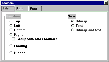
The settings notebook for the toolbars is displayed below.
For creating toolbar buttons, the Open Class Library supplies a set of bitmaps and associated bitmap and help text. These bitmaps are based on the IBM/Lotus approved set available for user interface application development.
The IBM/Lotus toolbar graphics consist of approximately 60 graphical images, each representing a common action. This collection was comprised from graphical images used in a number of IBM and Lotus applications.
The Open Class Library supplies these images (in the form of bitmaps), plus a few others for your use in toolbar buttons. In addition to the button bitmaps, the Open Class Library also supplies button text and short and long help text. The button text is used when toolbar buttons are set to text or to text and bitmap view. The help text is used to provide additional information to the user about the function of the button. The code samples display the short text for each button in fly-over help (sometimes called hover help), when the mouse is moved over a button. The samples display the long text for each button in an information area at the bottom of the main window. This text is also triggered by the movement of the mouse over a toolbar button.
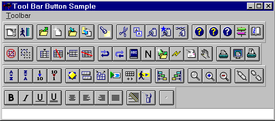
The resource IDs for these common bitmaps are defined in the icconst.h file. The following figure shows the commonly used bitmaps shipped with the Open Class Class Library:
When you build applications that use toolbars or any other resources provided, you must supply the Open Class Class Library resource DLL with your application.
The following is a list of the new toolbar button bitmaps and their associated text. The identifier (ID) is used when creating the toolbar button.
Note: The \n in the button text of certain buttons indicates a line break. When toolbar button text is displayed, the \n is removed, and the remaining text is continued on the next line.
ID:              IC_ID_CANCELOPERATION
Button Text:     Cancel
Short Help Text: Cancel Current Operation
Long Help Text:  End the current operation and discard any changes

ID:              IC_ID_EXIT
Button Text:     Exit
Short Help Text: Exit
Long Help Text:  Leave the application

ID:              IC_ID_OPEN
Button Text:     Open
Short Help Text: Open
Long Help Text:  Open another document/object

ID:              IC_ID_NEW
Button Text:     New
Short Help Text: New
Long Help Text:  Create a new document/object and open it

ID:              IC_ID_SAVE
Button Text:     Save
Short Help Text: Save
Long Help Text:  Save your current work

ID:              IC_ID_SAVE_AS
Button Text:     Save As
Short Help Text: Save As
Long Help Text:  Save a copy of the current document/object with a new name

ID:              IC_ID_LOCATE
Button Text:     Find...
Short Help Text: Find
Long Help Text:  Find within the current document/object

ID:              IC_ID_CUT
Button Text:     Cut
Short Help Text: Cut
Long Help Text:  Cut the selected object to the Clipboard

ID:              IC_ID_COPY
Button Text:     Copy
Short Help Text: Copy
Long Help Text:  Copy the selected object to the Clipboard

ID:              IC_ID_PASTE
Button Text:     Paste
Short Help Text: Paste
Long Help Text:  Paste from the Clipboard

ID:              IC_ID_PASTESPECIAL
Button Text:     Paste\nSpecial...
Short Help Text: Paste Special
Long Help Text:  Paste, link, or embed from the Clipboard

ID:              IC_ID_PASTELINK
Button Text:     Paste Link
Short Help Text: Paste Link
Long Help Text:  Paste a link from the Clipboard

ID:              IC_ID_HELP
Button Text:     Help
Short Help Text: Help
Long Help Text:  Display help text

ID:              IC_ID_GENERALHELP
Button Text:     General\nHelp
Short Help Text: General Help
Long Help Text:  Display general help information

ID:              IC_ID_HELPINDEX
Button Text:     Help Index
Short Help Text: Help Index
Long Help Text:  Display an index of all the available help

ID:              IC_ID_HELPTUTORIAL
Button Text:     Tutorial
Short Help Text: Take a Tutorial
Long Help Text:  Take a tutorial explaining how to use the application

ID:              IC_ID_USINGHELP
Button Text:     Using Help
Short Help Text: Using Help
Long Help Text:  Learn how to use help

ID:              IC_ID_DESELECTALL
Button Text:     Deselect\nAll
Short Help Text: Deselect All
Long Help Text:  Deselect all objects

ID:              IC_ID_SELECTALL
Button Text:     Select All
Short Help Text: Select All
Long Help Text:  Select all objects

ID:              IC_ID_INSERTCOLUMN
Button Text:     Insert\nColumn
Short Help Text: Insert Column
Long Help Text:  Insert a column into the table

ID:              IC_ID_DELETECOLUMNS
Button Text:     Delete\nColumn
Short Help Text: Delete Column
Long Help Text:  Delete the selected column(s)

ID:              IC_ID_INSERTROW
Button Text:     Insert Row
Short Help Text: Insert Row
Long Help Text:  Insert a row into the table

ID:              IC_ID_DELETEROWS
Button Text:     Delete Row
Short Help Text: Delete Row
Long Help Text:  Delete the selected row(s)

ID:              IC_ID_UNDO
Button Text:     Undo
Short Help Text: Undo
Long Help Text:  Undo the last action you took

ID:              IC_ID_REDO
Button Text:     Redo
Short Help Text: Redo
Long Help Text:  Redo the action you just undid

ID:              IC_ID_CHECKSPELLING
Button Text:     Spelling
Short Help Text: Check Spelling
Long Help Text:  Check the spelling

ID:              IC_ID_NORMAL
Button Text:     Normal\nText
Short Help Text: Normal Text
Long Help Text:  Remove emphasis from the selected text

ID:              IC_ID_ABOUT
Button Text:     Product\nInfo
Short Help Text: Product Info
Long Help Text:  Version, copyright and legal information

ID:              IC_ID_UPDATE
Button Text:     Update
Short Help Text: Update
Long Help Text:  Update the current view

ID:              IC_ID_MAILSEND
Button Text:     Send...
Short Help Text: Send This to Someone
Long Help Text:  Send the current document/object to another person

ID:              IC_ID_MOVEPAGES
Button Text:     Move Page
Short Help Text: Move Page
Long Help Text:  Move the current page to another position

ID:              IC_ID_PRINT
Button Text:     Print...
Short Help Text: Print
Long Help Text:  Print the current document/object

ID:              IC_ID_PRINTPREVIEW
Button Text:     Print\nPreview
Short Help Text: Print Preview
Long Help Text:  See how the document looks when printed

ID:              IC_ID_PRINTSETUP
Button Text:     Print\nSetup
Short Help Text: Print Setup
Long Help Text:  Display the current settings for printing

ID:              IC_ID_SORTAZ
Button Text:     Sort A-Z
Short Help Text: Sort Ascending (alphabetical)
Long Help Text:  Sort the selected objects in ascending alphabetical order

ID:              IC_ID_SORTZA
Button Text:     Sort Z-A
Short Help Text: Sort Descending (alphabetical)
Long Help Text:  Sort the selected objects in descending alphabetical order

ID:              IC_ID_SORTUP
Button Text:     Sort 1-9
Short Help Text: Sort Ascending (numeric)
Long Help Text:  Sort the selected objects in ascending numerical order

ID:              IC_ID_SORTDOWN
Button Text:     Sort 9-1
Short Help Text: Sort Descending (numeric)
Long Help Text:  Sort the selected objects in descending numerical order

ID:              IC_ID_SETTINGS
Button Text:     Properties
Short Help Text: Properties
Long Help Text:  Show properties of the current document/object

ID:              IC_ID_TOOLBAR
Button Text:     Show\nToolbar
Short Help Text: Show Toolbar
Long Help Text:  Display the toolbar for the application

ID:              IC_ID_TOOLBARSETUP
Button Text:     Toolbar\nSetup
Short Help Text: Toolbar Setup
Long Help Text:  Customize the setup of your toolbar

ID:              IC_ID_RUNSCRIPT
Button Text:     Run\nScript...
Short Help Text: Run a Script
Long Help Text:  Run a script

ID:              IC_ID_VPAPALETTE
Button Text:     Show\nActions...
Short Help Text: Show Actions and Properties You Can Add
Long Help Text:  Show a palette of available actions and properties you can add to this application

ID:              IC_ID_TOUR
Button Text:     Tour...
Short Help Text: Take a Tour
Long Help Text:  Take a tour of the application's features and learn how to use them

ID:              IC_ID_LEFTALIGNOBJ
Button Text:     Left Align
Short Help Text: Left Align Objects
Long Help Text:  Left align the selected objects

ID:              IC_ID_RIGHTALIGNOBJ
Button Text:     Right Align
Short Help Text: Right Align Objects
Long Help Text:  Right align the selected objects

ID:              IC_ID_ZOOM
Button Text:     Zoom
Short Help Text: Zoom
Long Help Text:  Zoom selected area , so it fills the work area

ID:              IC_ID_ZOOMIN
Button Text:     Zoom In
Short Help Text: Zoom In
Long Help Text:  Zoom in closer to the current document/object

ID:              IC_ID_ZOOMOUT
Button Text:     Zoom Out
Short Help Text: Zoom Out
Long Help Text:  Zoom out farther from the current document/object

ID:              IC_ID_LOGON
Button Text:     Logon
Short Help Text: Logon
Long Help Text:  Log on to the system

ID:              IC_ID_LOGOFF
Button Text:     Logoff
Short Help Text: Logoff
Long Help Text:  Log off the system

ID:              IC_ID_BOLD
Button Text:     Bold
Short Help Text: Bold
Long Help Text:  Make the selected text bold

ID:              IC_ID_ITALIC
Button Text:     Italic
Short Help Text: Italic
Long Help Text:  Make the selected text Italic

ID:              IC_ID_UNDERSCORE
Button Text:     Underline
Short Help Text: Underline
Long Help Text:  Underline the selected text

ID:              IC_ID_DOUBLEUNDERSCORE
Button Text:     Double\nUnderline
Short Help Text: Double Underline
Long Help Text:  Double underline the selected text

ID:              IC_ID_CENTER
Button Text:     Align\nCenter
Short Help Text: Align Center
Long Help Text:  Center align the selected text

ID:              IC_ID_LEFT
Button Text:     Align\nLeft
Short Help Text: Align Left
Long Help Text:  Left align the select text

ID:              IC_ID_RIGHT
Button Text:     Align\nRight
Short Help Text: Align Right
Long Help Text:  Right align the selected text

ID:              IC_ID_JUSTIFY
Button Text:     Justify
Short Help Text: Full Justify
Long Help Text:  Fully justify the selected text

ID:              IC_ID_CLEAR
Button Text:     Clear
Short Help Text: Clear
Long Help Text:  Clear the selected object(s)

ID:              IC_ID_DELETE
Button Text:     Delete
Short Help Text: Delete
Long Help Text:  Delete the selected object(s)
The new Open Class toolbar bitmaps differ in some ways from the previous Open Class toolbar bitmaps. In addition to the change in the number of bitmaps, their size, default transparent state, and the number of lines needed to display text have changed.
The new bitmaps consist of the 61 listed above. There are also 13 available in the current product. Each of these is also included in the new group. The actual graphic depiction of these 13 is replaced with a new representation. The ID you use to refer to the current bitmaps references the new bitmaps.
You can still reference the current bitmaps by using a new ID that corresponds to these bitmaps. These new IDs are as follows:
Each of the new bitmaps has a non-transparent gray background. This means that the solid background area of a bitmap does not show through the bitmap. Changing the default state of buttons from transparent to non-transparent is being done for performance. Displaying a bitmap with transparency involves creating a mask bitmap, which must be combined with the original bitmap and drawn to the screen. This operation is quite a bit slower than drawing a single non-transparent bitmap to the screen. In a toolbar with 10 or more buttons, this performance savings is clearly visible.
The background gray color selection is being carefully chosen. On Windows, the background gray has a Red, Green, Blue (RBG) value of (192,192,192). This matches the default gray used by Win32. On OS/2, the background RGB values are (204,204,204), to match the default gray used by OS/2 4.0.
To provide support for transparent buttons, we introduced a new style called IToolBarButton::transparentBitmap. If you want transparent behaviour for a particular button, you need to specify this style on button creation. In addition to specifying this style, you also need to define a color to be used for transparency. By default, a transparent color is initially defined. This color, pink, has an RGB value of (255,0,255). The following example sets up transparent behavior for one of the new button bitmaps:
   IToolBarButton * cutButton = new IToolBarButton(
             IC_ID_CUT, &toolBar, &toolBar,
             IRectangle(), IToolBarButton::defaultStyle() |
             IToolBarButton::transparentBitmap);


   //By default, a transparenent color of RGB value (255,0,255) has
   //already been set.  Reset the color to match the background in the bitmap.
   IColor *transparentColor = new IColor(192,192,192);  //Win32
   cutButton->setTransparentColor(*transparentColor);
Each of the new bitmaps is slightly larger. This in turn makes the toolbar button slightly larger. This change is being made for the following reasons: The larger size makes the buttons more readable. There is more room to depict each graphical image. The buttons are symmetrically square rather than rectangular, which with their larger size, makes them more consistent with the Lotus Smart Suite applications and other Win32 applications.
The button sizes are as follows:
                        Current Bitmaps    New Bitmaps
                        ---------------    -----------
  Bitmap size:               20x17            22x22
  Resulting button size:     27x24            29x29
To differentiate between similar images and actions, the button text (which can be seen when the button is displayed in text or bitmap and text view) is two lines on some buttons. These are:
The default for standard buttons (those created with the IToolBarButton::standardFormat style) is still to display only one line of text on a button when the button is displayed in text or bitmap and text view. This is being left unchanged to maintain consistency with existing Open Class toolbar applications and because the majority of the buttons have only one line of text.
If you are using one of the pre-defined buttons above, and your toolbar buttons are standard format, you can set the default number of lines of text to be displayed for toolbar buttons to 2. You call IToolBarButton::setStandardTextLines, as follows:
IToolBarButton::setStandardTextLines(2);
If you do not set the standard text lines to 2, the second line of text is not displayed.
The rationale behind adding a second line to display the extra text, is so that the toolbar lays-out better in an application. If the extra text were to be displayed on one long line, the buttons would need to be wide rectangular shaped to fit the text.
Each of the new toolbar bitmaps contains associated short and long help text. The help text is used to provide additional information to the user about the function of the button. Most often, application developers choose to display short text for a button in fly over help, which appears when the mouse is moved over a button. Developers often choose to display long text for a button in an information area at the bottom of a window. This text is also triggered by the movement of the mouse over a toolbar button.
You can still supply your own short and long help text, as you do in the current version of Open Class. However, if you want to use the Open Class supplied help text, you can do so in only a few lines of code:
  //Tell the IFlyOverHelpHandler to search for text in the Open Class
  //supplied resource library.
  flyHelpHandler.setResourceLibrary(
    IApplication::current().resourceLibrary().fileName() );

  //Tell the IFlyOverHelpHandler the offsets for the help text.
  flyHelpHandler.setFlyTextStringTableOffset(IC_FLYTEXTOFFSET);
  flyHelpHandler.setLongStringTableOffset(IC_LONGTEXTOFFSET);
If you want to supply your own help text, first ensure that the IFlyOverHelpHandler's resource library is the one bound to your application (which is the default for IFlyOverHandler). Second, associate your text string with the button ID in your resource file. You can optionally define an ID offset, as is done above.
If you have an existing Open Class application, you get the new bitmaps automatically with no changes needed to your application. Of course, if you want to take advantage of the short and long help text, or use one of the added bitmaps that have two lines of button text, you need to make some modifications to your program.
To revert back to the current bitmaps, you need to change your application to use the new IDs that refer to these bitmaps. These IDs are listed above. Secondly, you need to create each button with the IToolBarButton::transparentBitmap style.
If the window ID is in the Open Class library reserved range, the bitmap and text are loaded from the Open Class Library's resource library. Otherwise, the bitmap and text are loaded from the default user defined resource library. If no bitmap is found in the appropriate library, a default bitmap is loaded.
Providing Help Information
Using Default Direct
Manipulation
Enabling Direct
Manipulation
Adding Images to Drag
Items
ICustomButton
IToolBar
IToolBarButton
IFlyOverHelpHandler
IFlyText
